Notability Product Design

Recently I was preparing for interview for Associate Product Manager role. When I came across my own design doc, as I added more colors to distinguish different components, I started to look into if these different colors will still make sense to a color-blinded person. Then I quickly dropped my original approach of using red and green font to label different components. Here is a tool I found for finding color-blind friendly palette.
These small research I’ve done gives me the chance to look into the note taking app on iPad Pro, Notability. I was always confused about what the palette of the second page is used for.
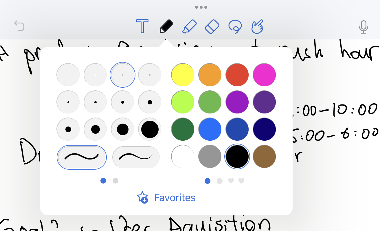
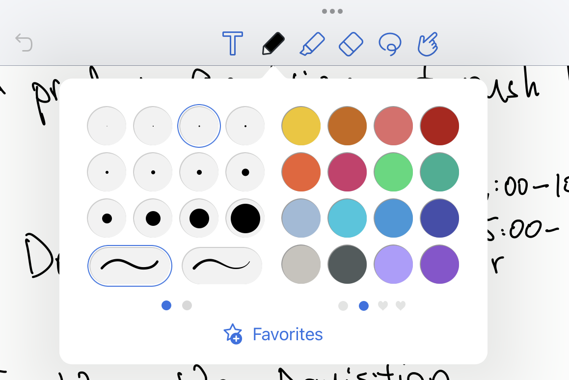
Now I look again, I realized the second palette is color blind friendly. Also, a small detail about it is how when you click on choosing the pen color, Notability will still defaultly open the last palette you opened previously. It also have a custom color chooser, so user can add new color to the third and forth palette.
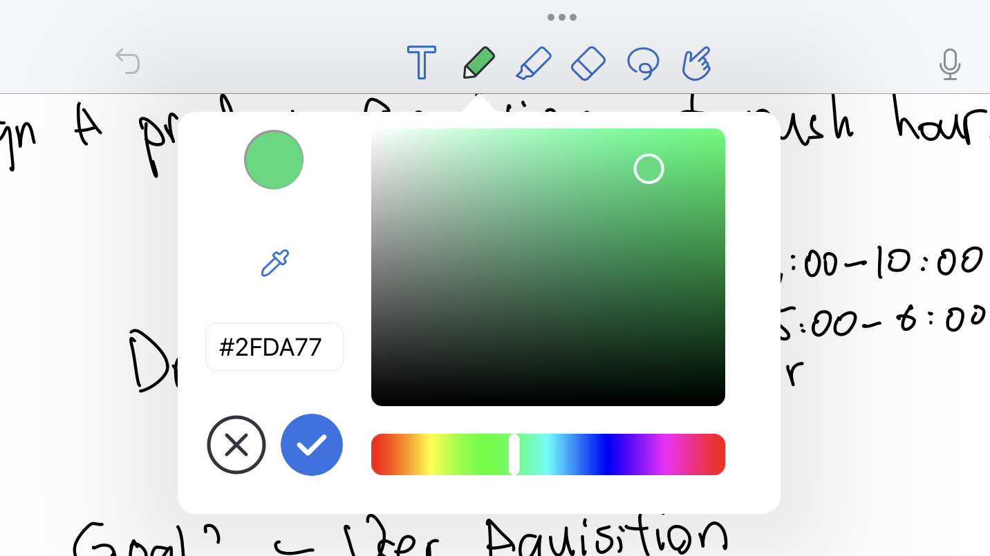
There are some more details I can appreciate from the above image. The small component above enabled us to select a color from the current page. Also, the button of “check” symbol is darker than the “cancel” symbol. The affordance of this feature is actually pretty good.
Okay, I’ll do less writing and start practicing for my APM interview. :)